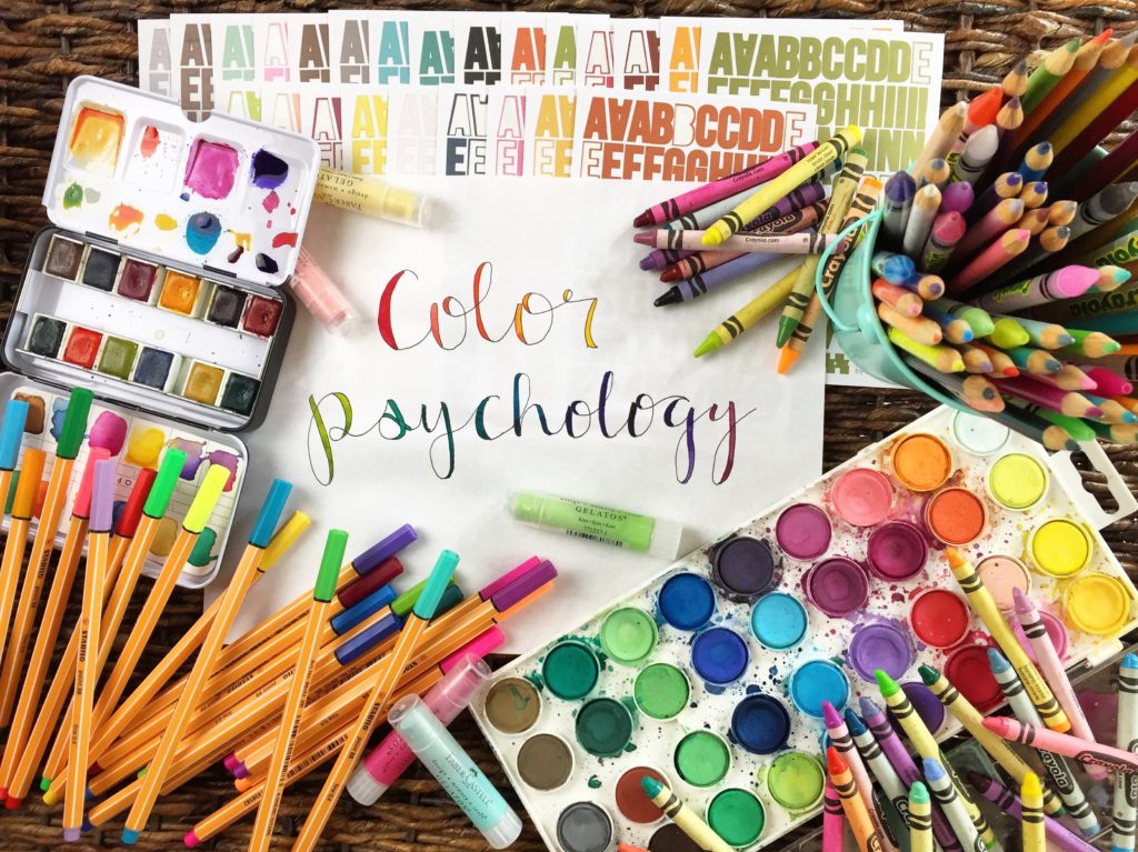
Hi Friends! I hope you are all doing well today. I’m so excited about today’s blog, you have no idea! Today we’re talking about color psychology and how we can use that in our Bible Journaling. I love all the colors. I’ve always struggled to pick a favorite and I’m always looking for the paints, pens, markers, pencils, stickers, etc. with the most color options. Am I alone in this? Does looking at a box of colorful crayons only make me really excited? I just love colors and I love having access to ALL the colors.
Color Psychology Basics
Color theory is a pretty complex part of art that I won’t claim to be an expert on. However, I feel confident saying that color is a vital part of art. Whether we choose vivid colors, dull colors or black and white, the colors we use help us tell the story our art is portraying. Color is one of the easiest elements of art to use, and yet is so complex.
Do you ever wonder why we choose certain colors for specific things? Why we’re drawn to some colors more than others? The basic reason is that colors make us feel things and remind of of things. Certain color combinations are more pleasing than others and some are so common they make us think of specific things.
Knowing that color can have an effect on our emotions and direct us to think of things, how can we use that to our advantage as we create pages in our journaling Bibles?
First, we should start by learning about what colors represent to the mind. A simple Google or Pinterest search will yield a lot of results for color psychology.


Color Psychology & Bible Journaling
Knowing what colors represent and how they can affect our emotions can help us in deciding what color scheme we want to use for each page.
Are you focusing on a passage of scripture that talks about Jesus as king? Purple could be a good choice because it’s a reminder of royalty. Perhaps you’re focusing on a passage about the peace of God, you might choose to use blue.
Maybe you want to focus on the mood your page portrays, rather than the idea. Maybe you want people to feel happy when they see the page because the passage of scripture should make you happy, then yellow would be a good option. It’s not too difficult to decide, once you are aware of what each color means and represents, what color to use to portray the emotion or idea you want.
Color Combinations
Once we’ve decided what our main color will be, what mood we want to set, we can decide what other colors to use. Most of us are aware of complimentary colors, colors opposite on the color wheel. But the good news is that we aren’t limited to complimentary color combinations. We can choose a monochrome combination, and analogous combination or even a combination of complementary analogous colors.
The diagram below shows what types of combinations are aesthetically pleasing. It’s linked to a website that has fantastic descriptions if you are interested in a more in-depth description.

There are many options for colors and color combinations that are visually appealing that will support the ideas and moods you want to create. The sky is the limit! What colors will you choose?
*Photos used are linked to source where found